Modals
With modals you can create pop-up forms that allow users to provide you with formatted inputs through submissions. We'll cover how to create, show, and receive modals
This page is a follow-up to the interactions (slash commands) page. Please carefully read that section first, so that you can understand the methods used in this section.
Building and responding with modals
Unlike message components, modals aren't strictly components themselves. They're a callback structure used to respond to interactions.
You can have a maximum of five Label or Text Display components per modal. Similarly a Label must only contain
one component.
To create a modal you construct a new ModalBuilder. You can then use the setters to add the custom id and title.
const { Events, ModalBuilder } = require('discord.js');

client.on(Events.InteractionCreate, async (interaction) => {
	if (!interaction.isChatInputCommand()) return;

	if (interaction.commandName === 'ping') {
		const modal = new ModalBuilder().setCustomId('myModal').setTitle('My Modal');

		// TODO: Add components to modal...
	}
});
The custom id is a developer-defined string of up to 100 characters. Use this field to ensure you can uniquely define all incoming interactions from your modals.
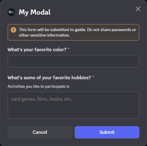
The next step is to add a Modal components to the modalBuilder. Which users responding can enter free-text. Adding inputs is similar to adding components to messages.
At the end, we then call ChatInputCommandInteraction#showModal to display the modal to the user.
const { Events, LabelBuilder, ModalBuilder, TextInputBuilder, TextInputStyle } = require('discord.js');

client.on(Events.InteractionCreate, async (interaction) => {
	if (!interaction.isChatInputCommand()) return;

	if (interaction.commandName === 'ping') {
		// Create the modal
		const modal = new ModalBuilder().setCustomId('myModal').setTitle('My Modal');

		// Create the text input components
		const favoriteColorInput = new TextInputBuilder()
			.setCustomId('favoriteColorInput')
			// Short means only a single line of text
			.setStyle(TextInputStyle.Short);

		const hobbiesInput = new TextInputBuilder()
			.setCustomId('hobbiesInput')
			// Paragraph means multiple lines of text.
			.setStyle(TextInputStyle.Paragraph)
			// Uninteractable text inside of the text input
			.setPlaceholder('card games, films, books, etc.');

		// Creating labels for the text input components
		const favoriteColorLabel = new LabelBuilder()
			// The label is the prompt the user sees for this component
			.setLabel("What's your favorite color?")
			// Add the text input to the label
			.setTextInputComponent(favoriteColorInput);

		const hobbiesLabel = new LabelBuilder()
			.setLabel("What's some of your favorite hobbies?")
			// The description is a small text under the label and above the interactive component
			.setDescription('Activities you like to participate in')
			.setTextInputComponent(hobbiesInput);

		// Add labels to the modal
		modal.addLabelComponents(favoriteColorLabel, hobbiesLabel);

		// Show the modal to the user
		await interaction.showModal(modal);
	}
});
Restart your bot and invoke the /ping command again. You should see the modal as imaged below:
Showing a modal must be the first response to an interaction. You cannot deferReply() or deferUpdate() then show a
modal later.
Receiving modal submissions
Interaction collectors
Modal submissions can be collected within the scope of the interaction that showed it by utilising an InteractionCollector, or the ChatInputCommandInteraction#awaitModalSubmit promisified method. These both provide instances of the ModalSubmitInteraction class as collected items.
For a detailed guide on receiving message components via collectors, please refer to the collectors guide.
The interactionCreate event
To receive a ModalSubmitInteraction event, attach an Client#interactionCreate event listener to your client and use the BaseInteraction#isModalSubmit type guard to make sure you only receive modals:
client.on(Events.InteractionCreate, (interaction) => {
	if (!interaction.isModalSubmit()) return;
	console.log(interaction);
});
Responding to modal submissions
The ModalSubmitInteraction class provides the same methods as the ChatInputCommandInteraction class. These methods behave equally:
reply()editReply()deferReply()fetchReply()deleteReply()followUp()
If the modal was shown from a ButtonInteraction or StringSelectMenuInteraction, it will also provide these methods, which behave equally:
update()deferUpdate()
client.on(Events.InteractionCreate, async (interaction) => {
	if (!interaction.isModalSubmit()) return;
	if (interaction.customId === 'myModal') {
		await interaction.reply({ content: 'Your submission was received successfully!' });
	}
});
If you're using typescript, you can use the ModalSubmitInteraction#isFromMessage type guard, to make sure the
received interaction was from a MessageComponentInteraction.
Extracting data from modal submissions
You'll most likely need to read the data sent by the user in the modal. You can do this by accessing the ModalSubmitInteraction#fields. From there you can call ModalSubmitFields#getTextInputValue with the custom id of the text input to get the value.
client.on(Events.InteractionCreate, (interaction) => {
	if (!interaction.isModalSubmit()) return;
	if (interaction.customId === 'myModal') {
		await interaction.reply({ content: 'Your submission was received successfully!' });

		// Get the data entered by the user
		const favoriteColor = interaction.fields.getTextInputValue('favoriteColorInput');
		const hobbies = interaction.fields.getTextInputValue('hobbiesInput');

		console.log({ favoriteColor, hobbies });
	}
});
Modal Components
Modals are built using components.
Current supported component for modals are: - Label - A layout component to add interactive components to modals - Text Display - A content component used to contain text
Label
A Layout component, labels are used to display a label and description ore interactive components in modals.
label can be a max length of 45 characters description can be a max length of 100 characters
Labels need to have one interactive components. Current supported component for labels are: - Text Input - An interactive component allowing free form text input - Select Menus - Interactive components allowing for limiting user input to users, roles, channels, and preselected options
Text Input
Input styles
Currently there are two different input styles available:
Short, a single-line text entryParagraph, a multi-line text entry
Input properties
In addition to the customId and style, a text input can be customised in a number of ways to apply validation, prompt the user, or set default values via the TextInputBuilder methods:
const input = new TextInputBuilder()
	// set the component id (this is not the custom id)
	.setId(0)
	// Set the maximum number of characters to allowed
	.setMaxLength(1_000)
	// Set the minimum number of characters required for submission
	.setMinLength(10)
	// Set a default value to pre-fill the text input
	.setValue('Default')
	// Require a value in this text input field (defaults to true)
	.setRequired(true);
Text Display
Modals support adding a texts display. Unlike interactive components a text display is added to the modal builder, without being put in a label first.
Adding text display components decrees the number of labels that can be added to the modal. The modal only has maximum
of five Label or Text Display components.
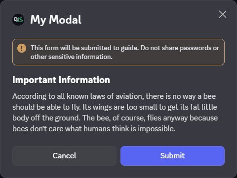
const modal = new ModalBuilder().setCustomId('myModal').setTitle('My Modal');

// Set the content of the text display
const text = new TextDisplayBuilder().setContent(
	"## Important Information\nAccording to all known laws of aviation, there is no way a bee should be able to fly. Its wings are too small to get its fat little body off the ground. The bee, of course, flies anyway because bees don't care what humans think is impossible.",
);

// Add the text display to the Modal
modal.addTextDisplayComponents(text);
Below image is an example of a modal with only one text display in it: